Which Paint Colors Make Art the Star of the Room?
- MK Pegues

- Oct 7, 2025
- 7 min read
Updated: Nov 18, 2025
For over 16 years, I’ve worked with homeowners and collectors, especially in the Texas Hill Country, to elevate their interiors through curated art placement. Over the years, I’ve watched design trends shift from quiet minimalism to bolder, more expressive aesthetics.
Right now, opulence is on the rise.
Rich color palettes, saturated textiles, and deeply layered interiors are making their way into high-end homes, and the results are stunning. Whether you’re designing a new home or simply refreshing a space, knowing the current color trends will help you choose confidently, especially when it comes to integrating original art.
1. Jewel Tones and Deep Hues

Velvet garnets, emerald greens, and deep sapphires are defining luxury interiors in 2025. These shades evoke drama and intimacy, especially when paired with finishes like aged brass, antique gold, or warm walnut.
Paint pick: Deep Sea Dive by Sherwin-Williams
There’s something quietly magnetic about this color. It’s a cool, saturated blue with a whisper of slate underneath. Like dusk settling in over the hills after a long summer day. Depending on the light, it can read as moody navy, softened charcoal, or even a shadowy indigo. I love it for creating a deeply restful, grounded atmosphere, especially in bedrooms, dining spaces, or reading nooks.

Pair it with aged brass or warm wood tones to add contrast and warmth. Accent with terra cotta, dusty blush, or soft linen white to keep the space elevated and layered. It's a color that invites quiet, comfort, and artful living.
2. Earthy Greens That Soothe and Ground
Nature-inspired greens like sage, laurel, and forest remain top picks in the Texas Hill Country. These tones offer balance and a calm palette that bridges rustic architecture with refined interiors.

Paint pick: Bitter Sage by Behr– Bitter Sage is one of those chameleon colors that feels both timeless and fresh. It’s a soft, grounded green with earthy undertones that shift gently with the light, calm in the morning, and cozy by candlelight. It brings a subtle richness to any space without overwhelming, making it a favorite for kitchens, built-ins, and entryways.

I love pairing it with warm whites, matte black fixtures, or natural oak to highlight its versatility. For a bolder contrast, try terra cotta, burnt sienna, or dusty rose accents. It’s a color that plays well with art and texture, especially when layered with organic textiles and natural materials.
3. Terra Cotta and Clay (My Personal Favorite)
I’m seeing more homeowners fall in love with the warm, nostalgic beauty of terra cotta and I’m right there with them. These hues are bold and earthy yet deeply comforting. They look especially striking in art-forward spaces with natural textures like linen, plaster, and stone.
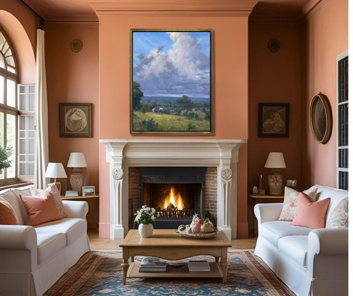
Paint pick: Georgian Leather by Gidden– Georgian Leather is my personal favorite. A cinnamon-kissed terracotta that feels like a love letter to the Texas Hill Country. Earthy, grounded, and rich with warmth, it captures the sunbaked tones of our native granite and weathered cedar finishes.

It glows beautifully in both natural and artificial light, shifting from a soft, golden ember by day to a cozy, amber rust at night. It’s stunning on an accent wall, cabinetry, or even a bold ceiling moment. I especially love it alongside matte black accents, aged brass, or creamy textures. Pair it with sage green, dusty rose, or soft sandstone neutrals for a palette that feels rooted yet refined.
This is the color I return to again and again. It feels like home, sunlight, and art all at once.
Design tip: Terracotta pairs beautifully with oil paintings, wood furnishings, and brass-framed art. It’s an excellent choice for art collectors who want their walls to feel warm and timeless, but never boring.
4. Dopamine Decor: Color That Makes You Feel Good

The rise of “dopamine decor” proves that color is no longer just a backdrop; it’s a mood booster. This trend is about joyful color choices that reflect your personality. Think mustard yellow, rose pink, cobalt blue, and chartreuse, all layered with purpose.
Paint pick: Clare Paint “Golden Hour” – Golden Hour is pure joy in a can. This rich, warm ochre is a dopamine color—radiating optimism, creativity, and a little golden drama. It casts a glow that feels like late-afternoon sunlight, instantly lifting the mood of any room.

It’s perfect for accent walls, powder rooms, or anywhere you want to infuse energy without losing sophistication. I love it paired with warm walnut woods, creamy whites, and brushed brass fixtures. For a playful yet elevated palette, mix it with olive green, terracotta, or deep navy. Whether you're curating an art wall or layering in vintage finds, Golden Hour brings a radiant, grounded energy that makes everything around it feel a little more alive.
Regional Insight: Color in the Texas Hill Country
Working with Fredericksburg homeowners since 2008 has shown me how the Hill Country’s unique architecture, rustic-modern sensibilities, limestone walls, reclaimed wood beams, and open layouts provide an inspiring canvas for vibrant interior color. Here’s how current color trends are enhancing luxury interiors across our region:
1. Sage Green Built‑ins
Sage captures the understated elegance of the Texas Hill Country: the misty softness of limestone ridges at dawn, the muted greens of mesquite and gnarled oak trees, and the quiet calm beneath wide, unbroken skies. It’s a color that feels rooted, made even richer by its contrast with the region’s fiery sunsets and springtime wildflowers that burst into bloom across the landscape.
In kitchens, sage green cabinetry balances sleek appliances and natural stone surfaces.
In libraries and study nooks, it frames artwork and sculptural pieces with graceful calm.
2. Terracotta Accents
As a personal favorite, terracotta brings warmth and regional authenticity. I love seeing it used in niches, fireplaces, accent walls or even ceilings, where its glow transforms a room.
Terracotta pairs beautifully with natural fiber rugs, brass lighting, and landscape-view windows.
It draws inspiration from the Hill Country’s earthy palette and its southwestern influences.
3. Dusty Rose and Clay Upholstery
Upholstered pieces in dusty rose or clay add softness and personality, especially when layered into rugged or neutral-hued rooms.
Think linen chairs or a blush-toned chaise.
These shades warm up a room while retaining elegance and sophistication.
My Advice on Color and Art Placement
Clients frequently ask how to select colors that complement their art collection. My response is always: start with what you love. Whether that’s a painting, sculpture, or photograph, and then build in layers with intention. Rich hues often elevate existing pieces and can lead you toward discovering new favorites.
In my experience, a well-chosen color has the power to turn an overlooked work into a beloved focal point.
Hill Country Design Talent
Amy Slaughter is the founder and principal designer at Slaughter Design Studio, a boutique interior design firm based in the Texas Hill Country. With over two decades of experience, she brings a refined yet approachable style to her projects, balancing thoughtful structure, rich color palettes, and curated fine art.

What sets Amy apart is her intuitive design process. She takes the time to understand her clients on a personal level, guiding them from initial concepts to the final reveal with a clear, confident vision. Whether she’s working on a ground-up new build, transforming a historic home, or refining a single room, Amy brings both creative insight and practical precision to every detail.

Her interiors feel layered, lived-in, and deeply connected to the local culture, especially when working with Hill Country architecture. Amy’s work is known for blending timeless elegance with modern comfort, often weaving in regional materials, heirloom pieces, and locally inspired art. Slaughter Design Studio | Interior Design in Fredericksburg, Texas
Melissa Estes is a Texas-based interior designer and artist whose work blends warmth, layered textures, and artistic nuance. A Fredericksburg resident since 2008, she brings both personal and professional depth to every project, balancing design finesse with heartfelt storytelling

What sets Melissa apart is her dual expertise. Not only is she a licensed designer, but she is also a practicing artist who creates abstract paintings rich in emotion and intent. She infuses her interiors with this creative sensibility, choosing color, texture, and furnishings as intentionally as she applies brushstrokes to canvas.

Melissa’s style is fearless yet refined, blending simplicity with selective extravagance. Whether sourcing vintage artifacts or designing new pieces, her spaces feel collected over time and deeply personal. She remains actively involved in every phase of design, from concept to installation, an attribute her clients frequently praise for its thoughtful continuity and creative clarity George II Interiors.
Color Trends Recap
Trend | The Paint | Where It Works Best |
Jewel tones | Libraries, studies, powder rooms | |
Dusty Rose/Clay | Upholstery and Accents | |
Nature-inspired greens | Kitchens, bedrooms, entryways | |
Terracotta & cinnamon hues | Accent walls, bathrooms, art-forward sitting rooms | |
Dopamine-inspired yellows | Living rooms, kitchens, studios |
Minimalism Out, Opulence In
Minimalism certainly had its moment, but it never quite suited the rich visual language of art. I believe that opulence, warmth, and personal expression are not just trending—they’re timeless. Color is a powerful tool in design. It sets the tone, supports your lifestyle, and elevates your art collection.
If you’re building, remodeling, or simply want to reimagine a space with art, I’d love to help you visualize the possibilities. From custom mock-ups of your walls with curated pieces to full art placement services, I can help you bring your vision to life, one beautiful hue at a time.
Are you looking to start or grow your art collection but unsure where to begin?
Our Free digital Guide to Collecting Art is your ultimate resource! Packed with expert insights, practical tips, and must-know strategies, this guide will help you navigate the art world with confidence—whether you're a first-time buyer or a seasoned collector. Discover how to find artwork that resonates with you, invest wisely, and build a collection that stands the test of time.

Download your free guide today and start your journey toward owning meaningful, investment-worthy art. Plus, explore our carefully curated selection of original artwork on
The Good Art Company where you'll find stunning pieces by talented artists, perfect for your home, office, or collection. Don't miss out, shop art now and bring beauty into your space!
Hi there! I'm MK and thank you for reading "Which Paint Colors Make Art the Star of the Room?"